Phished Hero Image
A square shape from logo
Responsive web design & development

Phished

Phished is a platform where users protect friends and family from phishing attacks by phishing them themselves. With this app, users can learn about phishing emails in a fun and engaging way, or just get some helpful tips and tricks to protect themselves from scams.
Team
2 x Graphic Designers
1 x UX Designer / Front-End Dev
1 x Front-End Developer
3 x Full-stack Developers
(7 members)
Duration
12 weeks
role / tools
UX Designer / Front-End Dev
Figma
Next.js
Mantine

The Scope

problem

Approximately 3.4 billion fraudulent emails are sent for phishing every day.
With the constant progress in technology, we are now able to create and access goods and services with more efficiency and higher quality than ever before. However, with this fast advancement of technology, people who are not familiar with technology have been taken advantage of and become a target of cybercrime.
Phishing techniques are constantly evolving and more common than ever.
Over 57% of Canadians had an online security issue, per the Canadian Internet Use survey. And elderly individuals are especially more vulnerable to these cybercrimes due to low-tech proficiency, low financial literacy, and higher prosperity.
As we live in a digital era, it is inevitable to learn and train to protect oneself from the online world.
When we surveyed to define our target users, we found out that the elders or novice technology users, who were our initial target users, didn’t prefer to explore and learn about cyber scams.
Instead, they preferred and trusted information and knowledge from their family and friends who were close to them.

goals

Our goal was to help users learn about cyber scams and practice in a safe and realistic environment without putting them at risk of financial or any loss. Most importantly, we aspired to encourage users to enjoy and have fun experiencing this learning phase so it would prompt them to share this experience with their friends and family.

The Research

BACKGROUND RESEARCH

Since phishing is a cyber scam that involves legal responsibilities, we researched in depth about phishing before we proceeded with any development in order to avoid any legal consequences despite of educational purpose of our product.

First, we researched to learn about what types of phishing there are, how they affect victims, and what they commonly consist.
Followed with it, we studied the legislation related to phishing scams from Canada's Anti-Spam Legislation(CASL) website learning about what defines prohibited activities through commercial electronic messages.

From this study, we set the requirement of our project, including having consent or express consent from phishee (the receiver), involving no money or funds, not collecting or harvesting personal information, and providing the unsubscribe option.

empathy map

After the initial user research, we learned that redirecting our target users to younger users who can easily acquire knowledge of, utilize our product, and eventually introduce our product to others. Based on this conclusion, we created an empathy map to learn about our new target user in-depth.

user persona

The empathy map concluded to redefine our target users to those who were more tech-literate, but willing to learn more about cyber attacks to teach novice users how to protect themselves from cyber-attacks.

User journey Map + Sitemap

Based on User Persona and Empathy map, we designed a user journey map and built our site map as users navigate throughout our platform.

Competitive analysis

We studied three competitors to learn about existing solutions and to differentiate our products. We found they target enterprise customers who would train a large number of employees and implement the tools and other services to alert and manage potential malicious emails. Additionally, they lacked a free trial demonstrating what to expect before users purchase. We also discovered that most of the products were not suitable for individual users and required additional coaches to use the product.

The Design Process

insight

The user and market research led us to focus on providing personalized or even customizable features based on individuals, and an intuitive interface design that could make our app easy to understand, learn and teach others.

wireframe

We prioritized simplicity, easy access, and intuition as we designed the sketch and developed our wireframes to lift off overwhelmingness for first-time users. Based on these points, we created our wireframe with initial components to envision potential user flows on our hi-fi prototype.

mid-fi prototype

After getting feedback from instructors, users, and peer developers, we created a Mid-fi prototype to showcase a more realistic overview and predictable user interaction. We could also narrow down the area to focus on to highlight our features.

styleguide + logo

According to the psychology of colour, we discovered that blue is commonly associated with relaxation and concentration, making it an ideal choice for learning-oriented products. However, we also wanted to infuse a sense of excitement and joy into our design, so we experimented with different shades and tones of blue to find the perfect balance.

Ultimately, we landed on a vibrant blue hue that evokes positive emotions while still conveying a sense of calm and focus.
When designing our logo, we wanted to play off the word “phish” and came up with the idea of using a fish as our mascot. The fish is designed to deliver the message, which ties into the idea of phishing. We incorporated the letter of the word “phish” into the fish’s body to create a playful pun.

For the colour of our logo, we went with a blue hue that we had already established in our style guide. This helps to maintain our brand’s overall feeling of comfort and familiarity, while also tying into the calming and trustworthy connotations often associated with the colour blue.

The Testing

User testing

With our Mid-fi prototype, we conducted user testing to identify any unforeseen usability issues and opportunities to enhance the user experience. From this testing, we discovered two major areas, Landing Page and Dashboard Page, to be improved for better user retention and engagement.

result & insight

For the Landing Page, 38% of participants indicated that the landing page was not user-friendly for first-time users. They were confused about the purpose and function of the application due to the lack of information provided on the landing page. These users expressed that they would prefer to learn more about the service before signing up, rather than being immediately prompted to register.

Additionally, the user testing revealed that the prominence of the Signup section on the landing page was perceived as forceful and could potentially deter users from exploring the rest of the site. They recommended including more information about the service on the landing page, making the signup section less prominent, and providing users with the option to explore the site before registering.

On the Dashboard Page, over 60% of users responded that the components on the Dashboard Page were simple and easy to understand their purpose. However, about 32% of users found the rate displayed under each phish name on the main dashboard confusing and the world ranking feature irrelevant to the product and not so useful. Most participants preferred to look into past campaigns to see what kind of campaign was conducted for a particular phishee as well as what campaign was currently ongoing.

The Final Result

Based on the user testing, our group deployed our product with updated design.

landing page

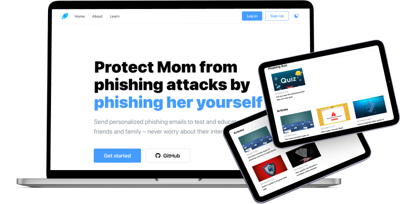
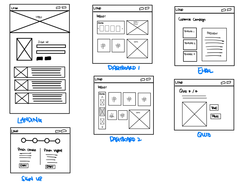
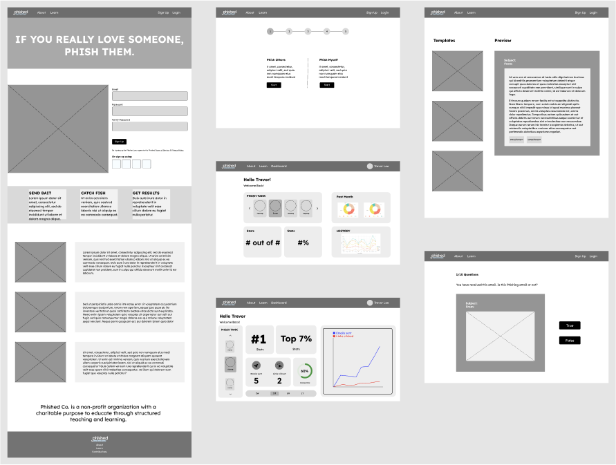
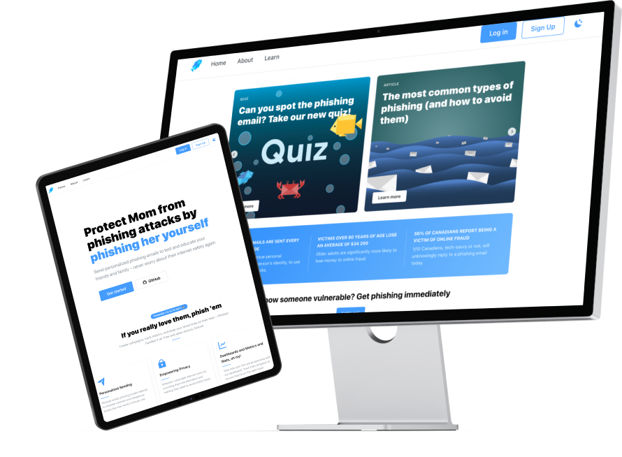
We removed the signup form on the landing page; instead, the signup/login buttons were only located on the navigation bar so that it felt less prominent.

We also simplified the services Phished provided and added card components to showcase so that the users could see what they would sign up for at a glance.

Landing Page - Demo

Sending email

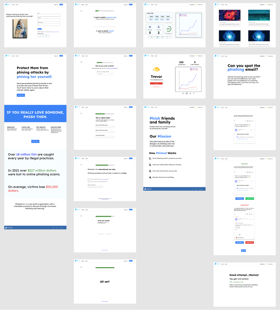
Through user testing, we’ve learned that some users struggled to create phishing-looking emails without a template. Thus, we created additional 5 email templates, including a google doc invitation, Facebook notification, LinkedIn confirmation, new device access notification, and payment notification.

When the targets click on the link in the email, we track the event and display the results in a dashboard to monitor the number of targets who fell for their campaign. In case a target falls for the phishing email, we redirect them to our learn page to educate them about the phishing email and how to avoid it in the future.

quiz & articles

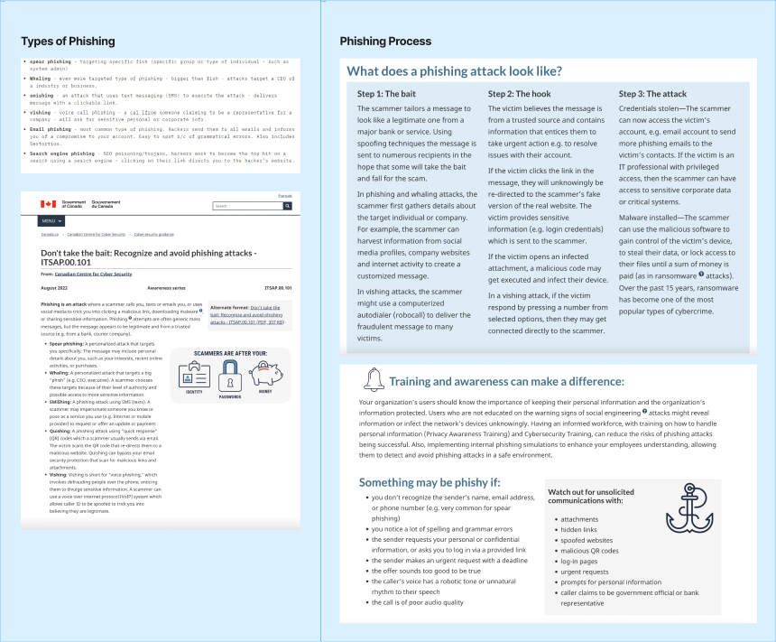
On the learn page, we provided quizzes and articles related to phishing emails. The quiz delivered several examples of emails containing common patterns and characteristics of phishing emails that users could receive in real life. Articles were additional resources to promote better security practices and learn how to improve users’ awareness of cyber threats.

takeaway

So, Phished has launched to the world. Unfortunately, some designs were not completed in a condensed. timeline.
Dashboard and Graphs

In the mid-fi prototype, we hardcoded graphs and statistics on the test user account. However, at the end of the development, we couldn't verify if the data was accurate due to insufficient test accounts.

Email Campaign Preview

The current version shows the preview of a phishing email campaign in plain text despite different styles of templates. This preview might make it less intuitive for users to envision how the email would look when the phishee received it.

Emails Categories and Styling

It also provides a plain text email as a style of phishing email for both campaigns and the quiz. If we had more time to work, we would categorize different types of emails such as financial institutes, social media, security alerts, and purchase confirmation to give more flexibility and liberty to design the campaigns and tailor their learning contents.

Through this project, I’ve learned the importance of time management at each stage of design and production. Even creating a timeline with constant updates and using Trello to visualize our project progress, we couldn’t fully bring our concept/design to creation.

Working with a team consisting of various roles (UI Designers, UX designers, Front-End Developers, and Back-End Developers) required a deep understanding of each role and the general duration of each task. And if I had a better understanding of them, I believe we would have completed our development and improvement.

I will continue to practice and learn to work as a group more efficiently and meet the expectations of the stakeholders. Until then, explore Phished and have fun learning about phishing!